Skip to content
Slumberland
Wendi Dunlap: design, music, art and commentary
About Me
Primary Menu
HOME
PORTFOLIO
Show sub menu
Album artwork
Objects
Patterns
Logos and branding
Print
Interior decoration
Websites
CONTACT
History
History
Seattle Area
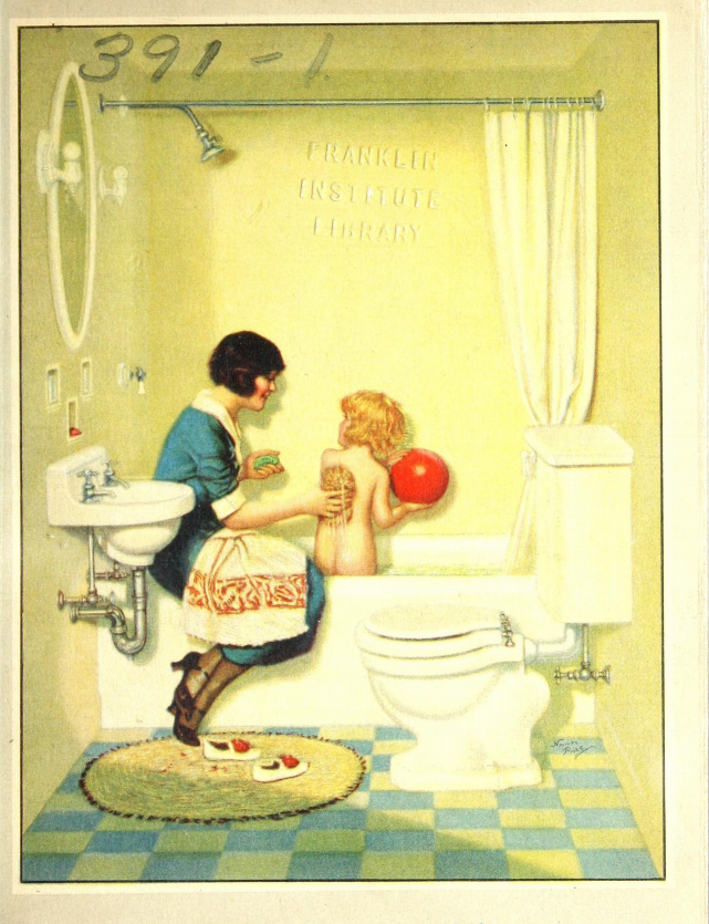
Bartell’s Soda Fountain, 1922
11 years ago
Food
History
Baking pans that sparkle
11 years ago
History
“Lives snuffed out before fear is even felt”
12 years ago
History
Language
Medieval and SCA
My surnames book is out!
12 years ago
History
Music
Pop Culture
Seattle Area
“Women Who Rock” and wear sparkly things
12 years ago
History
Nostalgia, etc.
“In a room five feet square.”
12 years ago
History
Medieval and SCA
Pinterest is not entirely clothes, food, and crafts
12 years ago
History
Nostalgia, etc.
CITRON DATES ORANGE
12 years ago
History
Four years old?!
15 years ago
History
Nostalgia, etc.
The newest fashions (in 1903)
16 years ago
History
Medical journal advertisements in 1886
16 years ago
Art
History
A wealth of stained glass on Flickr
17 years ago
History
Patterns
Pattern: Diane Sweater from 1921
18 years ago
History
The Gentleman’s Page
18 years ago
Art
Design
History
Pop Culture
Tasty art
18 years ago
Posts navigation
1
2
3
Next
Search for: